Python - Matplotlib
Introduction to Matplotlib
` # Matplotlib
Visualizing our data is crucial for data science. It gives us an overview and helps us to analyze data and make conclusions. Matplotlib is the library which we use for plotting and visualizing.
PLOTTING MATHEMATICAL FUNCTIONS
Now first we will be drawing some mathematical functions.
We need importing the matplotlib.pyplot module and also NumPy.
import numpy as np
import matplotlib.pyplot as plt
We are also using alias for pyplot. In this case, it is plt . In order to plot a function, we need the x-values or the input and the y-values or the output. So first let us generate the x-values.
x_values = np.linspace( 0 , 18 , 100 )We wll be doing this by using the already known linspace function. Here we create an array with 100 values between 0 and 18. To now get our y-values, we just need to apply the respective function on our
x-values. For this example, we are going with the sine function.
y_values = np.sin(x_values)Remember that the function gets applied to every single item of the input array. So in this case, we have an array with the sine value of every element of the x-values array. We just need to plot them now.
plt.plot(x_values, y_values)
plt.show()
We do this by using the function plot and passing our x-values and y-values. At the end we call the show function, to display our plot.
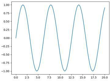
That was very simple. Now, we can go ahead and define our own function that we want to plot.
x = np.linspace( 0 , 10 , 100 )
y = ( 6 * x - 30 ) ** 2
plt.plot(x, y)
plt.show()
The result looks like this:
This function (6x – 30)² is plotted with Matplotlib.
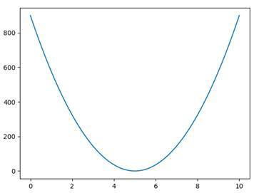
VISUALIZING VALUES
What we can also do, instead of plotting functions, is just visualizing values in form of single dots for example.
numbers = 10 * np.random.random( 100 )
plt.plot(numbers, 'bo' )
plt.show()
Here we generate 100 random numbers from 0 to 10. We then plot these numbers as blue dots. This is defined by the second parameter ‘bo’ , where the first letter indicates the color (blue) and the second one the shape (dots).
MULTIPLE GRAPHS
We can plot multiple functions in different color and shape.
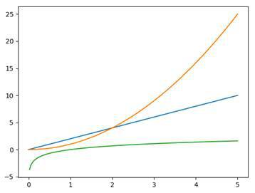
x = np.linspace( 0 , 5 , 200 )
y1 = 2 * x
y2 = x ** 2
y3 = np.log(x)
plt.plot(x, y1)
plt.plot(x, y2)
plt.plot(x, y3)
plt.show()
In this example, we first generate 200 x-values from 0 to 5. Then we define three different functions y1, y2 and y3 . We plot all these and view the plotting window. This is what it looks like:
SUBPLOTS
Now, sometimes we want to draw multiple graphs but we don’t want them in the same plot necessarily. For this reason, we have so-called subplots . These are plots that are shown in the same window but independently from each other.
x = np.linspace( 0 , 5 , 200 )
y1 = np.sin(x)
y2 = np.sqrt(x)
plt.subplot( 211 )
plt.plot(x, y1, 'r-' )
plt.subplot( 212 )
plt.plot(x, y2, 'g--' )
plt.show()
By using the function subplot we state that everything we plot now belongs to this specific subplot. The parameter we pass defines the grid of our window. The first digit indicates the number of rows, the second the number of columns and the last one the index of the subplot. So in this case, we have two rows and one column. Index one means that the respective subplot will be at the top.
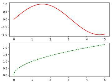 As you can see, we have two subplots in one window and both have a different color and shape. Notice that the ratios between the x-axis and the y-axis differ in the two plots.
MULTIPLE PLOTTING WINDOWS
Instead of plotting into subplots, we can also go ahead and plot our graphs into multiple windows. In Matplotlib we call these figures .
plt.figure( 1 )
plt.plot(x, y1, 'r-' )
plt.figure( 2 )
plt.plot(x, y2, 'g--' )
By doing this, we can show two windows with their graphs at the same time. Also, we can use subplots within figures.
PLOTTING STYLES
In order to use a style, we need to import the style module of Matplotlib and then call the function use .
from matplotlib import style
style.use( 'ggplot' )
By using the from … import … notation we don’t need to specify the parent module matplotlib . Here we apply the style of ggplot . This adds a grid and some other design changes to our plots. For more information, check out the link above.
LABELING DIAGRAMS
In order to make our graphs understandable, we need to label them properly. We should label the axes, we should give our windows titles and in some cases we should also add a legend.
SETTING TITLES
Let’s start out by setting the titles of our graphs and windows.
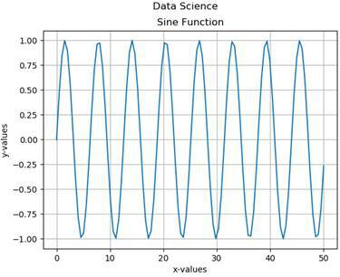
x = np.linspace( 0 , 50 , 100 )
y = np.sin(x)
plt.title( 'Sine Function' )
plt.suptitle( 'Data Science' )
plt.grid( True )
plt.plot(x,y)
plt.show()
In this example, we used the two functions title and suptitle . The first function adds a simple title to our plot and the second one adds an additional centered title above it. Also, we used the grid function, to turn on the grid of our plot.
If you want to change the title of the window, you can use the figure function that we already know.
plt.figure( 'MyFigure' )LABELING AXES
As a next step, we are going to label our axes. For this, we use the two functions xlabel and ylabel .
plt.xlabel( 'x-values' )
plt.ylabel( 'y-values' )
You can choose whatever labels you like. When we combine all these pieces of code, we end up with a graph like this:
In this case, the labels aren’t really necessary because it is obvious what we see here. But sometimes we want to describe what our values actually mean and what the plot is about.
LEGENDS
Sometimes we will have multiple graphs and objects in a plot. We then use legends to label these individual elements, in order to make everything more readable.
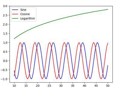
x = np.linspace( 10 , 50 , 100 )
y1 = np.sin(x)
y2 = np.cos(x)
y3 = np.log(x/ 3 )
plt.plot(x,y1, 'b-' , label = 'Sine' )
plt.plot(x,y2, 'r-' , label = 'Cosine' )
plt.plot(x,y3, 'g-' , label = 'Logarithm' )
plt.legend( loc = 'upper left' )
plt.show()
Here we have three functions, sine , cosine and a logarithmic function. We draw all graphs into one plot and add a label to them. In order to make these labels visible, we then use the function legend and specify a location for it. Here we chose the upper left . Our result looks like this:
SAVING DIAGRAMS
So now that we know quite a lot about plotting and graphing, let’s take a look at how to save our diagrams.
plt.savefig( 'functions.png' )Actually, this is quite simple. We just plot whatever we want to plot and then use the function savefig to save our figure into an image file.