Data Science Posts and Resources

Articles on Data Science

Python - Matplotlib- Plot Types

Matplotlib- Plot Types

Laxmi K Soni

7-Minute Read

MATPLOTLIB PLOT TYPES

Matplotlib offers a huge arsenal of different plot types. Here we are going to take a look at these.

HISTOGRAMS

Let’s start out with some statistics here. So-called histograms represent the distribution of numerical values. For example, we could graph the distribution of heights amongst students in a class.

mu, sigma = 172 , 4
x = mu + sigma * np.random.randn( 10000 ) 

We start by defining a mean value mu (average height) and a standard deviation sigma . To create our x-values, we use our mu and sigma combined with 10000 randomly generated values. Notice that we are using the randn function here. This function generates values for a standard normal distribution , which means that we will get a bell curve of values.

plt.hist(x, 100 , density = True , facecolor = 'blue' ) 

Then we use the hist function, in order to plot our histogram. The second parameter states how many values we want to plot. Also, we want our values to be normed. So we set the parameter density to True . This means that our y-values will sum up to one and we can view them as percentages. Last but not least, we set the color to blue.

Now, when we show this plot, we will realize that it is a bit confusing. So we are going to add some labeling here.

plt.xlabel( 'Height' )
plt.ylabel( 'Probability' )
plt.title( 'Height of Students' )
plt.text( 160 , 0.125 , 'µ = 172, σ = 4' )
plt.axis([ 155 , 190 , 0 , 0.15 ])
plt.grid( True )

First we label the two axes. The x-values represent the height of the students, whereas the y-values represent the probability that a randomly picked student has the respective height. Besides the title, we also add some text to our graph. We place it at the x-value 160 and the y-value of 0.125. The text just states the values for µ (mu) and σ (sigma).

Last but not least, we set the ranges for the two axes. Our x-values range from 155 to 190 and our y-values from 0 to 0.15. Also, the grid is turned on. This is what our graph looks like at the end:

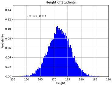
We can see the Gaussian bell curve which is typical for the standard normal distribution.

BAR CHART

For visualizing certain statistics, bar charts are oftentimes very useful, especially when it comes to categories. In our case, we are going to plot the skill levels of three different people in the IT realm.

bob = ( 90 , 67 , 87 , 76 )
charles = ( 80 , 80 , 47 , 66 )
daniel = ( 40 , 95 , 76 , 89 )
skills = ( 'Python' , 'Java' , 'Networking' , 'Machine Learning' )

Here we have the three persons Bob, Charles and Daniel . They are represented by tuples with four values that indicate their skill levels in Python programming, Java programming, networking and machine learning.

width = 0.2
index = np.arange( 4 )
plt.bar(index, bob,
width =width, label = 'Bob' )
plt.bar(index + width, charles,
width =width, label = 'Charles' )
plt.bar(index + width * 2 , daniel,width =width, label = 'Daniel' )

We then use the bar function to plot our bar chart. For this, we define an array with the indices one to four and a bar width of 0.2. For each person we plot the four respective values and label them.

plt.xticks(index + width, skills)
plt.ylim( 0 , 120 )
plt.title( 'IT Skill Levels' )
plt.ylabel( 'Skill Level' )
plt.xlabel( 'IT Skill' )
plt.legend()

Then we label the x-ticks with the method xticks and set the limit of the y-axis to 120 to free up some space for our legend. After that we set a title and label the axes. The result looks like this:

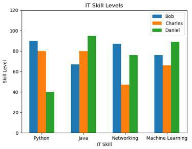
We can now see who is the most skilled in each category. Of course we could also change the graph so that we have the persons on the x-axis with the skill-colors in the legend.

PIE CHART

Pie charts are used to display proportions of numbers. For example, we could graph how many percent of the students have which nationality.

labels = ( 'American' , 'German' , 'French' , 'Other' )
values = ( 47 , 23 , 20 , 10 ) 

We have one tuple with our four nationalities. They will be our labels. And we also have one tuple with the percentages.

plt.pie(values, labels =labels,
autopct = '%.2f%%' , shadow = True )
plt.title( 'Student Nationalities' )
plt.show()

Now we just need to use the pie function, to draw our chart. We pass our values and our labels. Then we set the autopct parameter to our desired percentage format. Also, we turn on the shadow of the chart and set a title. And this is what we end up with:

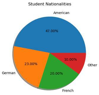
As you can see, this chart is perfect for visualizing percentages.

SCATTER PLOTS

So-called scatter plots are used to represent two-dimensional data using dots.

x = np.random.rand( 50 )
y = np.random.rand( 50 )
plt.scatter(x,y)
plt.show()

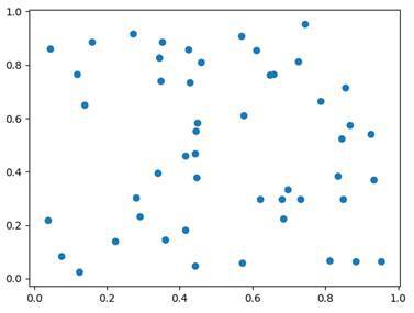
Here we just generate 50 random x-values and 50 random y-values. By using the scatter function, we can then plot them.

BOXPLOT

Boxplot diagrams are used, in order to split data into quartiles . We do that to get information about the distribution of our values. The question we want to answer is: How widely spread is the data in each of the quartiles.

mu, sigma = 172 , 4
values = np.random.normal(mu,sigma, 200 )
plt.boxplot(values)
plt.title( 'Student's Height' )
plt.ylabel( 'Height' )
plt.show()

In this example, we again create a normal distribution of the heights of our students. Our mean value is 172, our standard deviation 4 and we generate 200 values. Then we plot our boxplot diagram.

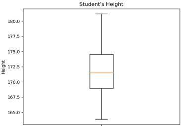
Here we see the result. Notice that a boxplot doesn’t give information about the frequency of the individual values. It only gives information about the spread of the values in the individual quartiles. Every quartile has 25% of the values but some have a very small spread whereas others have quite a large one.

3D PLOTS

Now last but not least, let’s take a look at 3D-plotting. For this, we will need to import another plotting module. It is called mpl_toolkits and it is part of the Matplotlib stack.

from mpl_toolkits import mplot3d

Specifically, we import the module mplot3d from this library. Then, we can use 3d as a parameter when defining our axes.

ax = plt.axes( projection = '3d' )
plt.show()

We can only use this parameter, when mplot3d is imported. Now, our plot looks like this:

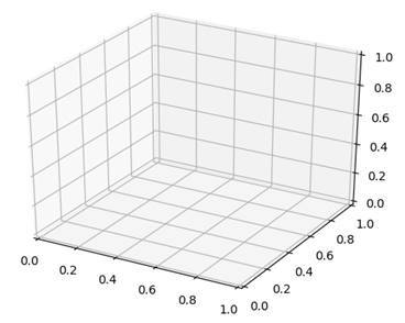
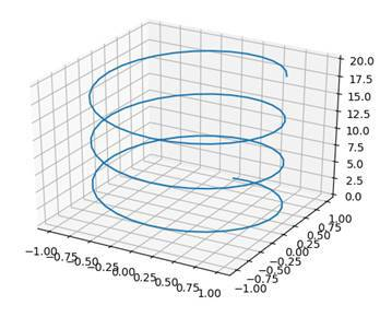
Since we are now plotting in three dimensions, we will also need to define three axes.

z = np.linspace( 0 , 20 , 100 )
x = np.sin(z)
y = np.cos(z)
ax = plt.axes( projection = '3d' )
ax.plot3D(x,y,z)
plt.show()

In this case, we are taking the z-axis as the input. The z-axis is the one which goes upwards. We define the x-axis and the y-axis to be a sine and cosine function. Then, we use the function plot3D to plot our function. We end up with this:
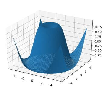
SURFACE PLOTS

Now in order to plot a function with a surface, we need to calculate every point on it. This is impossible, which is why we are just going to calculate enough to estimate the graph. In this case, x and y will be the input and the z-function will be the 3D-result which is composed of them.

ax = plt.axes( projection = '3d' )
def z_function(x, y):
  return np.sin(np.sqrt(x ** 2 + y ** 2 ))
x = np.linspace(- 5 , 5 , 50 )
y = np.linspace(- 5 , 5 , 50 )

We start by defining a z_function which is a combination of sine, square root and squaring the input. Our inputs are just 50 numbers from -5 to 5.

X, Y = np.meshgrid(x,y)
Z = z_function(X,Y)
ax.plot_surface(X,Y,Z)
plt.show()

Then we define new variables for x and y (we are using capitals this time). What we do is converting the x- and y-vectors into matrices using the meshgrid function. Finally, we use the z_function to calculate our z-values and then we plot our surface by using the method plot_surface

Say Something

Comments

Nothing yet.

Recent Posts

Categories

About

about

ling the library.

RANGES

Instead of just filling arrays with the same values, we can fill create sequences of values by specifying the boundaries. For this, we can use two different functions, namely arange and linspace .

a = np.arange( 10 , 50 , 5 )

The function arange creates a list with values that range from the minimum to the maximum. The step-size has to be specified in the parameters.

[10 15 20 25 30 35 40 45]

In this example, we create have count from 10 to 45 by always adding 5. The result can be seen above.

By using linspace we also create a list from a minimum value to a maximum value. But instead of specifying the step-size, we specify the amount of values that we want to have in our list. They will all be spread evenly and have the same distance to their neighbors.

b = np.linspace( 0 , 100 , 11 )

Here, we want to create a list that ranges from 0 to 100 and contains 11 elements. This fits smoothly with a difference of 10 between all numbers. So the result looks like this:

[ 0. 10. 20. 30. 40. 50. 60. 70. 80. 90. 100.]

Of course, if we choose different parameters, the numbers don’t be that “beautiful”.

NOT A NUMBER (NAN)

There is a special value in NumPy that represents values that are not numbers. It is called NaN and stands for Not a Number . We basically just use it as a placeholder for empty spaces. It can be seen as a value that indicates that something is missing at that place.

When importing big data packets into our application, there will sometimes be missing data. Instead of just setting these values to zero or something else, we can set them to NaN and then filter these data sets out.

ATTRIBUTES OF ARRAYS

NumPy arrays have certain attributes that we can access and that provide information about the structure of it.

UMPY ARRAY ATTRIBUTES
a.shape Returns the shape of the array
e.g. (3,3) or (3,4,7)
a.ndim Returns how many dimensions our array has
a.size Returns the amount of elements an array has
a.dtype Returns the data type of the values in the array

MATHEMATICAL OPERATIONS

Now that we know how to create an array and what attributes it has, let’s take a look at how to work with arrays. For this, we will start out with basic mathematical operations.

ARITHMETIC OPERATIONS

a = np.array([
[ 1 , 4 , 2 ],
[ 8 , 8 , 2 ]
])
print (a + 2 )
## [[ 3  6  4]
##  [10 10  4]]
print (a - 2 )
## [[-1  2  0]
##  [ 6  6  0]]
print (a * 2 )
## [[ 2  8  4]
##  [16 16  4]]
print (a / 2 )
## [[0.5 2.  1. ]
##  [4.  4.  1. ]]

When we perform basic arithmetic operations like addition, subtraction, multiplication and division to an array and a scalar, we apply the operation on every single element in the array. Let’s take a look at the results:

[[ 3 6 4] [10 10 4]] [[-1 2 0] [ 6 6 0]] [[ 2 8 4] [16 16 4]] [[0.5 2. 1. ] [4. 4. 1. ]]

As you can see, when we multiply the array by two, we multiply every single value in it by two. This is also the case for addition, subtraction and division. But what happens when we apply these operations on two arrays?

a = np.array([
[ 1 , 4 , 2 ],
[ 8 , 8 , 2 ]
])
b = np.array([
[ 1 , 2 , 3 ]
])
c = np.array([
[ 1 ],
[ 2 ]
])
d = np.array([
[ 1 , 2 , 3 ],
[ 3 , 2 , 1 ]
]) 

In order to apply these operations on two arrays, we need to take care of the shapes. They don’t have to be the same, but there has to be a reasonable way of performing the operations. We then again apply the operations on each element of the array.

For example, look at a and b . They have different shapes but when we add these two, they share at least the amount of columns.

print (a+b)
## [[ 2  6  5]
##  [ 9 10  5]]

[[ 2 6 5] [ 9 10 5]]

Since they match the columns, we can just say that we add the individual columns, even if the amount of rows differs. The same can also be done with a and c where the rows match and the columns differ.

print (a+c)
## [[ 2  5  3]
##  [10 10  4]]

[[ 2 5 3] [10 10 4]]

And of course it also works, when the shapes match exactly. The only problem is when the shapes differ too much and there is no reasonable way of performing the operations. In these cases, we get ValueErrors .

MATHEMATICAL FUNCTIONS

Another thing that the NumPy module offers us is mathematical functions that we can apply to each value in an array.

NUMPY MATHEMATICAL FUNCTIONS
np.exp(a) Takes e to the power of each value
np.sin(a) Returns the sine of each value
np.cos(a) Returns the cosine of each value
np.tan(a) Returns the tangent of each value
np.log(a) Returns the logarithm of each value
np.sqrt(a) Returns the square root of each value

AGGREGATE FUNCTIONS

Now we are getting into the statistics. NumPy offers us some so-called aggregate functions that we can use in order to get a key statistic from all of our values.

NUMPY AGGREGATE FUNCTIONS
a.sum() Returns the sum of all values in the array
a.min() Returns the lowest value of the array
a.max() Returns the highest value of the array
a.mean() Returns the arithmetic mean of all values in the array
np.median(a) Returns the median value of the array
np.std(a) Returns the standard deviation of the values in the array

MANIPULATING ARRAYS

NumPy offers us numerous ways in which we can manipulate the data of our arrays. Here, we are going to take a quick look at the most important functions and categories of functions. If you just want to change a single value however, you can just use the basic indexing of lists.

a = np.array([
[ 4 , 2 , 9 ],
[ 8 , 3 , 2 ]
])
a[ 1 ][ 2 ] = 7 

SHAPE MANIPULATION FUNCTIONS

One of the most important and helpful types of functions are the shape manipulating functions . These allow us to restructure our arrays without changing their values.

SHAPE MANIPULATION FUNCTIONS
a.reshape(x,y) Returns an array with the same values structured in a different shape
a.flatten() Returns a flattened one-dimensional copy of the array
a.ravel() Does the same as flatten but works with the actual array instead of a copy
a.transpose() Returns an array with the same values but swapped dimensions
a.swapaxes() Returns an array with the same values but two swapped axes
a.flat Not a function but an iterator for the flattened version of the array

There is one more element that is related to shape but it’s not a function. It is called flat and it is an iterator for the flattened one-dimensional version of the array. Flat is not callable but we can iterate over it with for loops or index it.

for x in a.flat:
  print (x)
## 4
## 2
## 9
## 8
## 3
## 7
print (a.flat[ 5 ])
## 7

JOINING FUNCTIONS

We use joining functions when we combine multiple arrays into one new array.

JOINING FUNCTIONS
FUNCTION DESCRIPTION
np.concatenate(a,b) Joins multiple arrays along an existing axis
np.stack(a,b) Joins multiple arrays along a new axis
np.hstack(a,b) Stacks the arrays horizontally (column-wise)
np.vstack(a,b) Stacks the arrays vertically
(row-wise)

In the following, you can see the difference between concatenate and stack :

a = np.array([ 10 , 20 , 30 ])
b = np.array([ 20 , 20 , 10 ])
print (np.concatenate((a,b)))
## [10 20 30 20 20 10]
print (np.stack((a,b)))
## [[10 20 30]
##  [20 20 10]]

[10 20 30 20 20 10] [[10 20 30] [20 20 10]]

What concatenate does is, it joins the arrays together by just appending one onto the other. Stack on the other hand, creates an additional axis that separates the two initial arrays.

SPLITTING FUNCTIONS

We can not only join and combine arrays but also split them again. This is done by using splitting functions that split arrays into multiple sub-arrays.

SPLITTING FUNCTIONS
np.split(a, x) Splits one array into multiple arrays
np.hsplit(a, x) Splits one array into multiple arrays horizontally (column-wise)
np.vsplit(a, x) Splits one array into multiple arrays vertically (row-wise)

When splitting a list with the split function, we need to specify into how many sections we want to split our array.

a = np.array([
[ 10 , 20 , 30 ],
[ 40 , 50 , 60 ],
[ 70 , 80 , 90 ],
[ 100 , 110 , 120 ]
])
print (np.split(a, 2 ))
## [array([[10, 20, 30],
##        [40, 50, 60]]), array([[ 70,  80,  90],
##        [100, 110, 120]])]
print (np.split(a, 4 ))
## [array([[10, 20, 30]]), array([[40, 50, 60]]), array([[70, 80, 90]]), array([[100, 110, 120]])]

This array can be split into either two or four equally sized arrays on the default axis. The two possibilities are the following:

1: [[10, 20, 30],[40, 50, 60]] 2: [[70, 80, 90],[100, 110, 120]]

OR

1: [[10, 20, 30]] 2: [[40, 50, 60]] 3: [[70, 80, 90]] 4: [[100, 110, 120]]

ADDING AND REMOVING

The last manipulating functions that we are going to look at are the ones which allow us to add and to remove items.

ADDING AND REMOVING FUNCTIONS
np.resize(a, (x,y)) Returns a resized version of the array and fills empty spaces by repeating copies of a
np.append(a, […]) Appends values at the end of the array
np.insert(a, x, …) Insert a value at the index x of the array
np.delete(a, x, y) Delete axes of the array

LOADING AND SAVING ARRAYS

Now last but not least, we are going to talk about loading and saving NumPy arrays. For this, we can use the integrated NumPy format or CSV-files.

NUMPY FORMAT

Basically, we are just serializing the object so that we can use it later. This is done by using the save function.

a = np.array([
[ 10 , 20 , 30 ],
[ 40 , 50 , 60 ],
[ 70 , 80 , 90 ],
[ 100 , 110 , 120 ]
])
np.save( 'myarray.npy' , a)

Notice that you don’t have to use the file ending npy . In this example, we just use it for clarity. You can pick whatever you want. Now, in order to load the array into our script again, we will need the load function.

a = np.load( 'myarray.npy' )
print (a)

CSV FORMAT

As I already mentioned, we can also save our NumPy arrays into CSV files, which are just comma-separated text files. For this, we use the function savetxt .

np.savetxt( 'myarray.csv' , a)

Our array is now stored in a CSV-file which is very useful, because it can then also be read by other applications and scripts.

In order to read this CSV-file back into our script, we use the function loadtxt .

a = np.loadtxt( 'myarray.csv' )
print (a)

If we want to read in a CSV-file that uses another separator than the default one, we can specify a certain delimiter.

a = np.loadtxt( 'myarray.csv' , delimiter = ';' )
print (a)

Now it uses semi-colons as separator when reading the file. The same can also be done with the saving or writing function

Say Something

Comments

Nothing yet.

Recent Posts

Categories

About

about